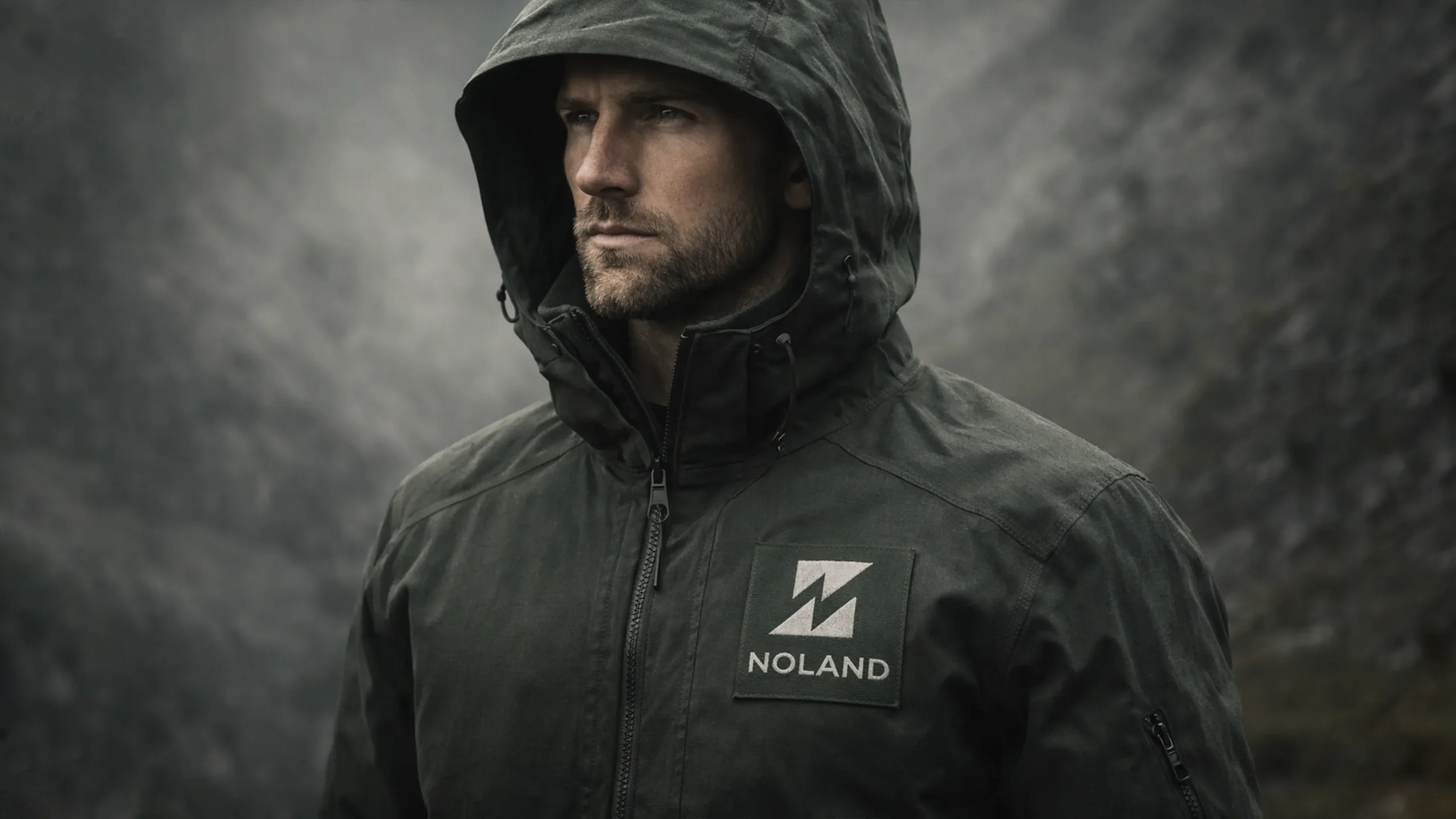
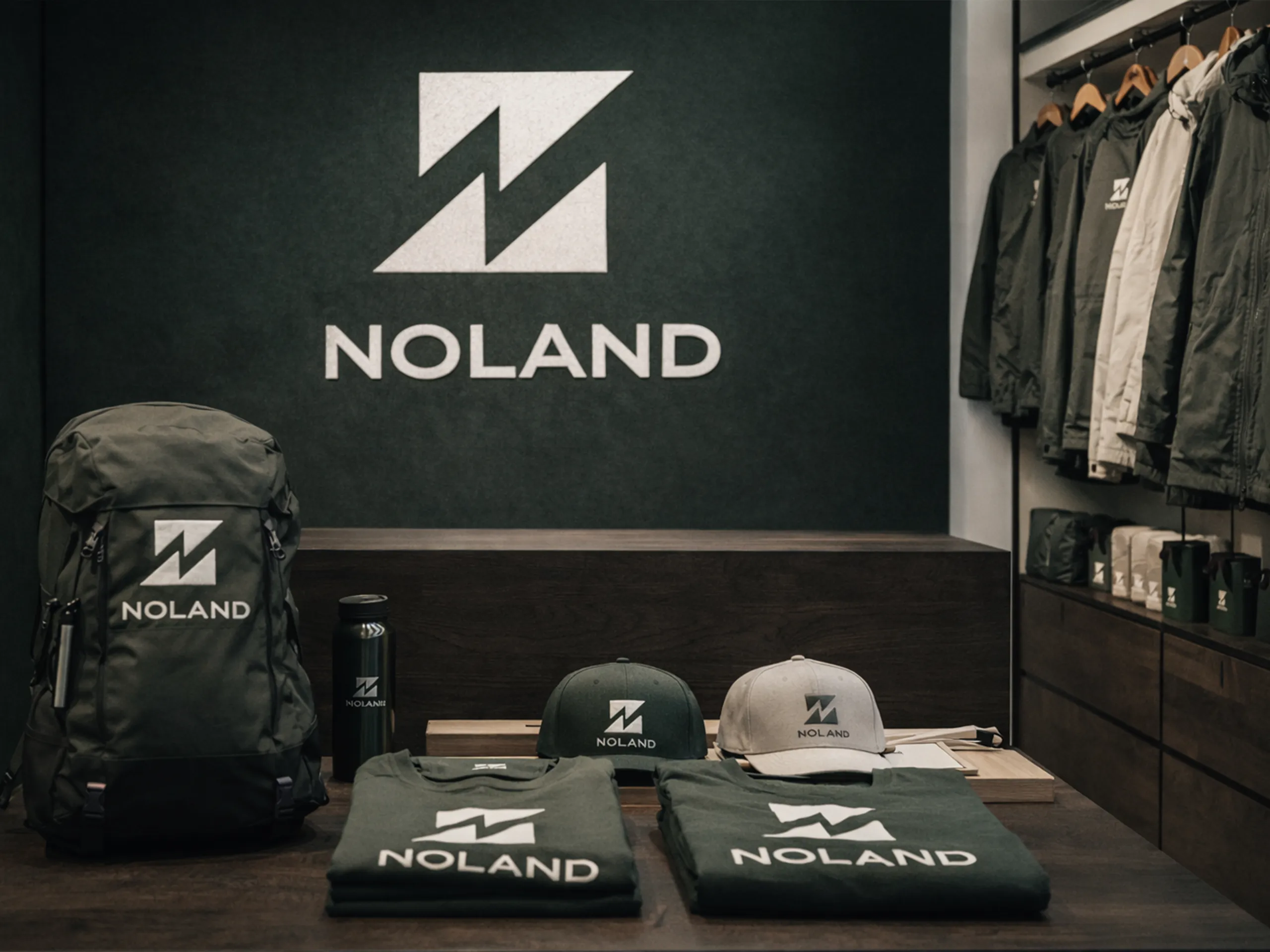
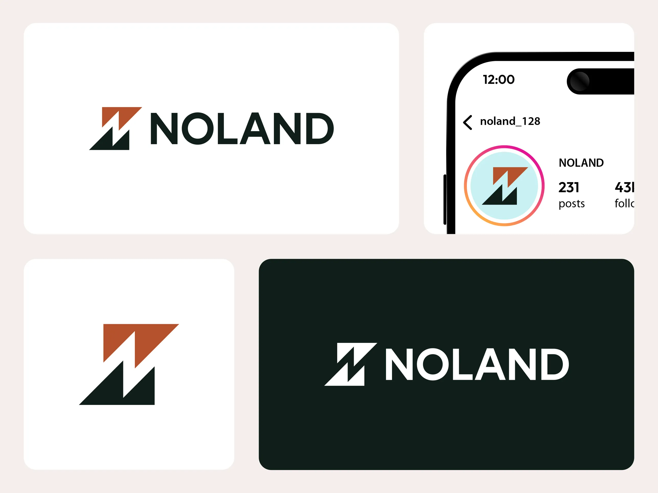
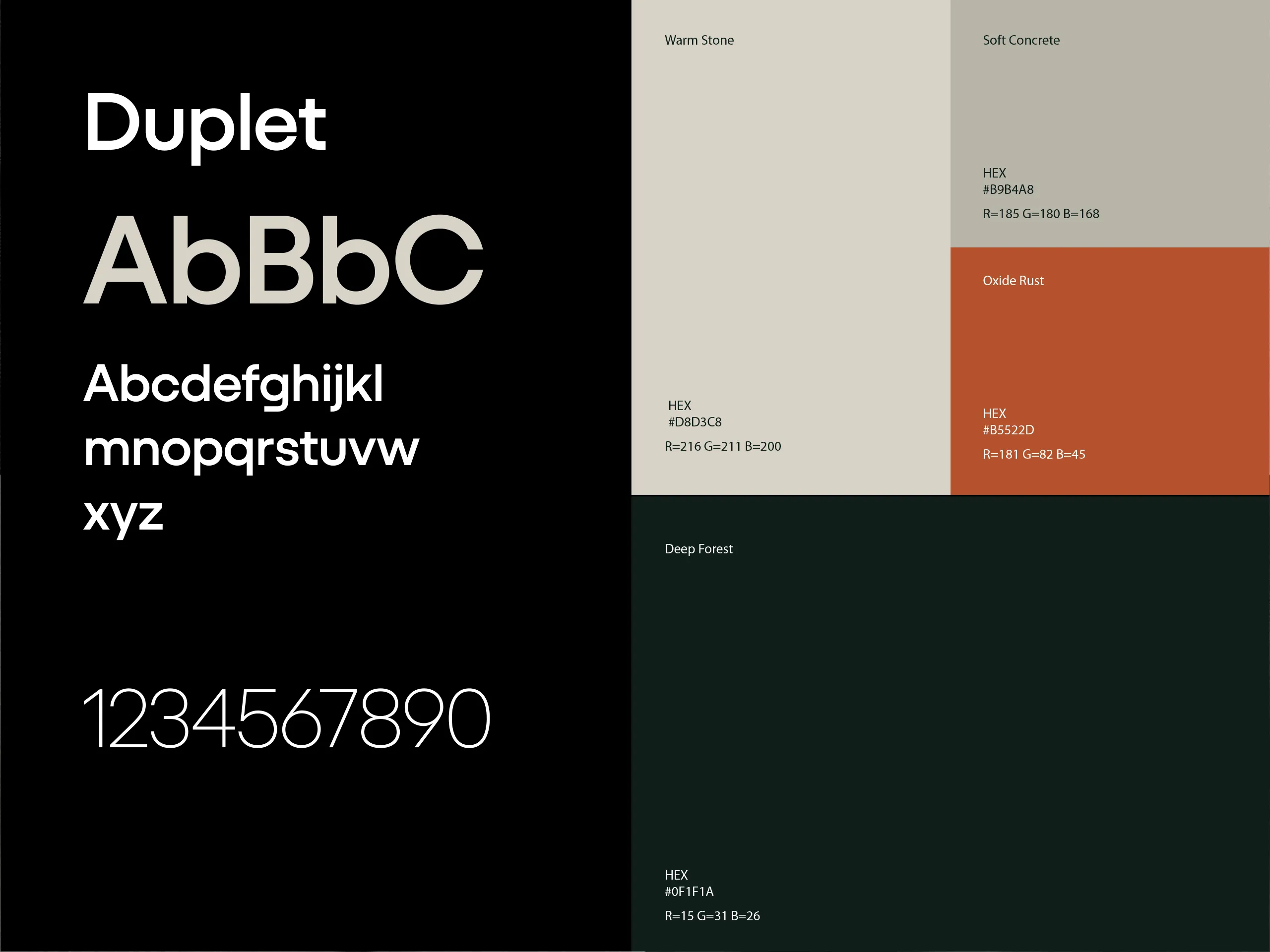
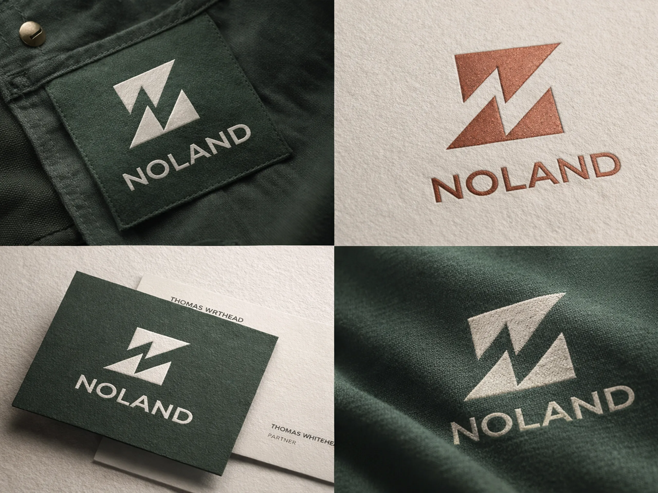
Company

Noland

NOLAND is a premium outdoor performance brand designed for individuals who operate beyond limits. The brand represents elevation — physically, mentally, and strategically. Inspired by mountains and structured geometry, NOLAND embodies strength, ambition, and clarity. The name “NOLAND” symbolizes independence — not bound to one place, but driven by purpose and movement. The brand is positioned at the intersection of minimalism and performance.

Industry

Premium Outdoor & Performance Apparel

Service Provided

Brand Strategy & Identity Definition

Location

USA

Duration

5 Day

Project Overview

NOLAND is a premium outdoor and performance apparel brand built for modern explorers who demand durability, functionality, and refined minimal aesthetics. The brand identity was developed around the concept of strength, elevation, and precision, expressed through a geometric mountain-inspired symbol with a bold negative-space “N” at its core. The visual direction embraces the “Deep Forest & Stone” palette, reinforcing a grounded, natural, and resilient brand personality. From logo architecture to apparel mockups and high-end brand presentation, the project establishes NOLAND as a sophisticated yet rugged outdoor brand positioned for global expansion.

The Challenge

The primary challenge was to create a performance apparel identity that felt both powerful and minimal without relying on overused outdoor design clichés. The brand needed to communicate durability, adventure, and trust while maintaining a clean, modern structure suitable for premium positioning. Additionally, the mark had to function seamlessly across apparel applications, embroidery, packaging, digital platforms, and large-scale mockups without losing clarity or impact. Balancing geometric sharpness with emotional connection to nature required strategic visual refinement.

The Solution

The solution was a structured brand system centered on a bold geometric emblem symbolizing twin mountain peaks while subtly forming the letter “N” in negative space, reinforcing memorability and brand ownership. The Deep Forest & Stone color system elevated the brand with a mature, earthy sophistication that aligns with high-performance outdoor gear. A clean sans-serif wordmark enhances legibility and strength, while adaptable logo variations ensure seamless application across jackets, tags, packaging, and digital media. The final identity delivers a confident, premium, and scalable brand foundation ready for apparel production, e-commerce presence, and global outdoor market positioning.

✦ Let's work together

Working with Pixdez is refreshingly simple.