Food Delivery / Quick Service Restaurant (QSR)
Brand Strategy & Identity
USA
3 Days
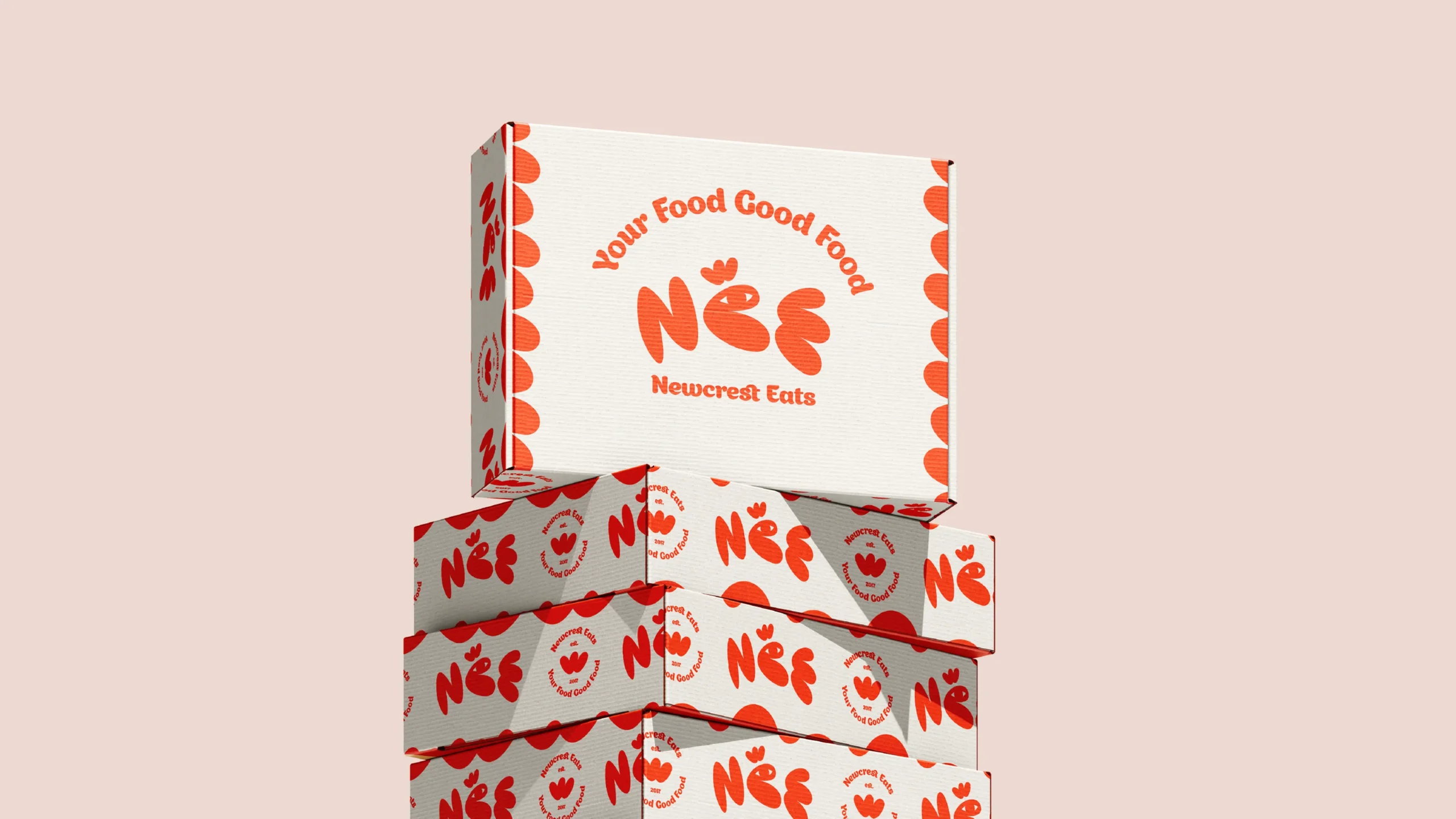
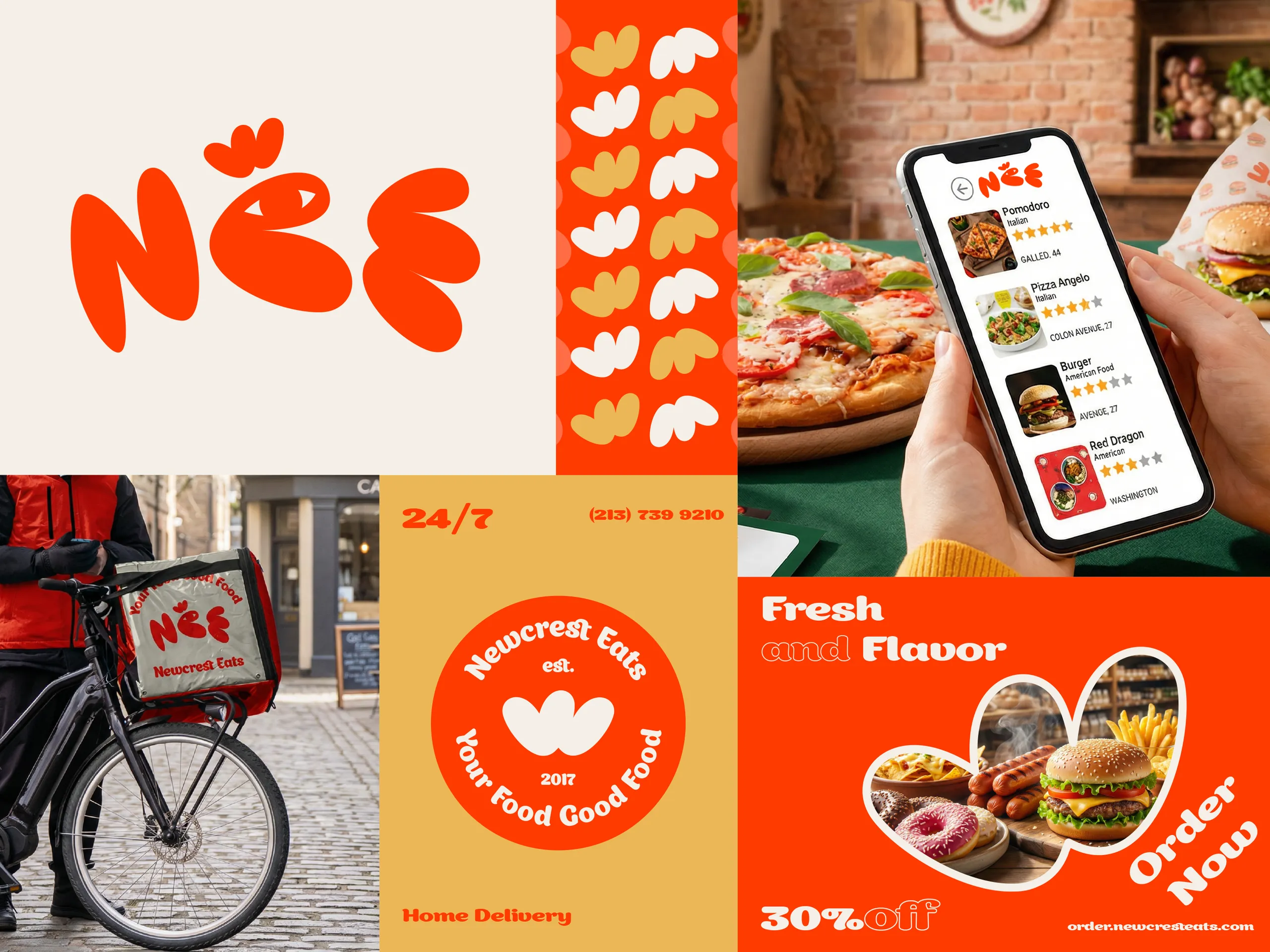
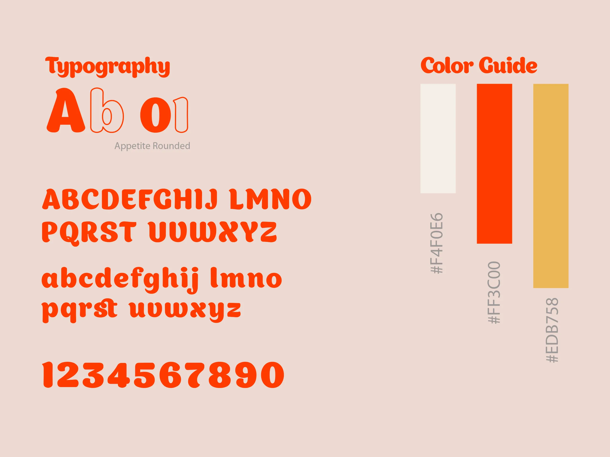
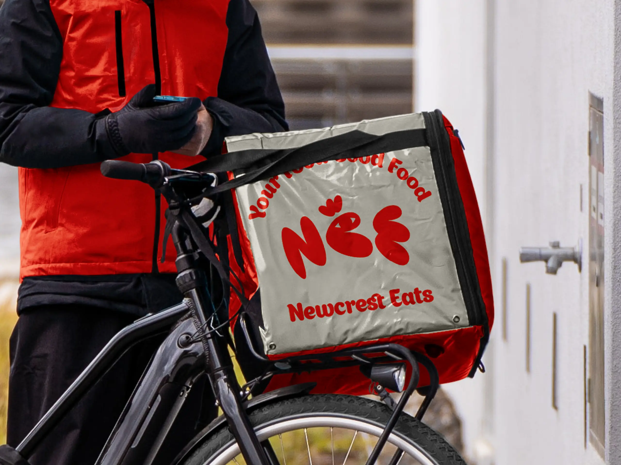
The Newcrest Eats project focused on building a bold, memorable brand identity that could compete in the fast-moving food delivery market. The objective was to create a visually distinctive system that felt energetic, modern, and instantly recognizable across packaging, mobile applications, and delivery assets. Rather than relying on generic food branding, the identity was designed to create strong shelf presence, digital clarity, and high recall value. Every design element — from typography to pattern system — was developed to ensure consistency across physical packaging and digital ordering platforms.
The food delivery industry is saturated with similar visual approaches — red color palettes, predictable typography, and overused food imagery. The challenge was to build a brand that feels playful and bold without losing professionalism or scalability. Newcrest Eats needed a cohesive identity that would work equally well on delivery boxes, rider bags, social promotions, and mobile UI screens while maintaining strong brand recognition in a highly competitive market.
We developed a high-impact visual identity built around a custom wordmark, expressive typography, and a vibrant color system centered on energetic orange tones. A repeatable pattern system was introduced to enhance packaging visibility and create brand memorability at scale. The logo and badge variations were crafted to function seamlessly across delivery assets, promotional materials, and digital platforms. The final identity positions Newcrest Eats as fresh, confident, and instantly recognizable — a brand designed not just to serve food, but to own visual space in the modern food delivery ecosystem.